
Lessons Learned from Building a React Component Library with TypeScript

Component libraries are all the rage. Shopify, Salesforce, IBM, and even the United States government have joined countless other organizations and businesses in building component libraries. They’re the subject of blog posts, podcasts, and YouTube tutorials. All that’s left is a Ken Burns documentary on the subject.
In fact, I am a software architect and senior engineer, and I currently lead the development of a React component library that will be the basis for the UIs for a prominent US government agency. I want to share with you my lessons learned in project management, communications, accessibility, engineering, and testing to build something that will impact the lives of millions. And the ups and downs of it all.
So what’s the big deal with component libraries?
The Design System
It doesn’t start with a component library; it starts with a design system. The Nielsen Norman Group defines design systems this way:
A design system is a complete set of standards intended to manage design at scale using reusable components and patterns.
A design system enumerates the standards and practices that comprise the premier UX for consumers of your brand. It expresses the nomenclature every team should use in communications to break down silos and avoid the impulse from Conway’s Law. There are basic rules about colors, typography, spacing, and so on. All of these core principles become the basis for larger components—explicit ones like buttons and date pickers and subtler ones like grid systems.
Our UX team develops and maintains our design system. Like software, it evolves; it’s versioned; and it’s collaborative. There are conversations
among the UX designers and with me and other architects and engineers on the program about what makes sense and what is feasible.
Are nested dropdowns necessary? Do we have time to create our own perfect Datepicker? Or do we try to customize something open source?
How do we feel about disabled buttons, and if we think they make sense, how
can we overcome common pitfalls like poor contrast ratios?
Stuff like that. We use the language of Atomic Design, which deconstructs web interfaces into entities ranging from “atoms” to “pages,” as a common nomenclature to describe the goals of the design system.
The challenge, and probably the hardest part of building a component library for us, is the tooling. Partly because of the preferences of the UX team and partly because of constraints on our development environment due to the sensitive nature of our work, we have not been able to streamline automation for versioning UX wireframes or translating them into artifacts engineers can use to build. As a result, we work with wireframes that are cumbersome to understand. In order to even view them, we either need to install the tool on our machines, which costs more licenses and imposes a burden on developer experience (DX), or we need to wade through literally hundreds of static asset files with a custom browser plugin. Neither is an optimal experience. Beyond that, it’s a manual process to track consistency between the design system and the component library as both evolve.
I never said it was pretty, but it isn’t all bad either.
The Value of a Component Library
The design system is a set of core principles independent of implementation details. You can choose to implement these principles and make them real for UI engineers with whatever technology you choose.
For us, that’s React. Our React components generate a lot of value for the program.
Consistency
Our component library enforces our design system across our development teams. Using the components all but guarantees a UI will be consistent with our brand and provide our users the best, most intuitive experience. Developers can feel confident they are using components vetted with the UX team, which frees them up to work on the specific use cases of their services rather than cross-cutting concerns like consistency with the design system.
The library also maximizes the likelihood that our UIs pass visual testing by our UX team. This is important as violations slow down our delivery cadence and ability to get feedback.
Accessibility
Related to consistency is accessibility, which is a first-class priority for our component library. Accessibility, commonly known as #a11y, is more than just empowering the visually impaired. It also means empowering people who experience difficulty with hearing, motion, dexterity, or anything else. It means empowering everyone.
The program is required by contract and by law to produce UIs that are accessible—specifically 508 compliance. That said, accessibility is far more than a professional obligation; it is my personal priority. It is very important to me that everything I build is intuitive for every user.
I will elaborate on this shortly, but our component library is built for accessibility. Development teams
can trust the accessibility of the individual components, and as I said before, focus on their own use cases. Of course you
are probably thinking in terms of accessible dropdowns and autocompletes and datepickers, which we have, but we also
provide helper Semantic HTML components.
For example, the library features Section, which represents the section HTML element
as you would imagine, and SectionGrid, which is a section element endowed with our design system grid.
Of course, the component library can only take developers part of the way to full accessibility, but it’s nice not to have to start from 0.
Reusability
We have worked very hard to provide intuitive APIs for our components, but the task is trickier than you might think. The
APIs need to impose enough opinion so that consumers don’t violate the design system but allow enough freedom for the components
to support a wide range of use cases. For our Button component, that is easy enough. For layout components like
Card and Page, it’s tougher. The reusability that results has made individual teams and the entire program so much more productive.
We also go out of our way to endow our components with as little functionality as possible. Component APIs offer props that enable library
consumers on the development teams to supply behavior. For an obvious example, developers supply onClick behavior to the
Button component. We have more complex components that need to maintain their own state,
but we try to minimize that where possible. This provides a clean separation of concerns, which makes testing our components much easier,
and anyone who has been in the game long enough knows that strong testability makes for strong reusability.
Encapsulation
There will be more about this shortly, but we do not build our components from scratch. Rather, we customize existing open source
components and map our APIs to theirs. This abstracts the implementation details of the component from our development teams.
For example, we use react-datepicker as the basis for our own DatePicker,
but if we decide to swap it out for a different one, our consumers will be none the wiser.
Component Stack
As I mentioned, we build our component library with React, which is what we recommended but is also, for our risk-averse government customer, the safe choice given its backing by Facebook, its market penetration, and its popularity.
But React is the easy part. Let’s look at other parts of the component stack.
TypeScript
When we started building the component library, I considered TypeScript essential for two reasons. By enforcing type safety during development and at build time, we catch bugs much faster, which from a project management standpoint is much cheaper. More importantly, building our APIs in TypeScript is a huge help to library consumers on application development teams by facilitating code completion in their IDEs and type checking in their builds.
Let me also mention that some of our TypeScript APIs require ARIA values to promote accessibility if we can’t derive them ourselves from other props.
Chakra UI
I mentioned earlier that our components are built on open source components, and most of them are built on Chakra UI. There are many other open source component libraries out there, but Chakra UI is my favorite by far. The primary reasons are its first-class commitment to accessibility and the intuitive APIs of its components built with TypeScript. As you can probably infer, Chakra UI is an inspiration to me when building our own component library on top of it.
Chakra UI also offers a powerful theme customization API we leverage heavily to apply the principles of our design system to Chakra components via dedicated theme files that separate the styling from functionality. This separation of concerns makes it easier to reason about our code and makes the files themselves a lot lighter.
Chakra UI also features with some helpful hooks like useDisclosure that come in handy.
If you use Chakra UI for your own component library, you will probably need some alias imports to deal with name collisions.
For example, we call our button components, to no one’s surprise, Button, but so does Chakra UI. So we do this:
import { Button as ChakraButton } from "@chakra-ui/react"Engineering
Of course the fun part is building a React component library. This post is long enough, so I can’t get into every detail. But I do want to address some of the key aspects you might want to consider when you build your own.
Workflow
When we first began building the component library, we needed to move quickly because development teams were waiting on us to start building their UIs. Our management tasked me and several developers to get something done in a few sprints at nearly a full time commitment.
We got the initial design system specification from the UX team and got to work. After those first few sprints, we had built enough components to allow teams to get going. The problem is that all of us resumed our normal duties with no time allocation for the library. This meant that whenever the UX team designed new components or developers found bugs in existing components, there was a bottleneck because no one was dedicated to upgrading the library. I and others got to it when we could, but the absence of a dedicated team was a problem.
Another problem is the initial lack of communication within the UX team itself and among the UX team, developers, and me. In their creative zeal, far too often they provided wireframes to some developers inconsistent with wireframes provided to others, or they provided wireframes featuring components that weren’t in the library. Development teams assumed they were in the library and estimated accordingly. As you might expect, they were unhappy when they discovered the components didn’t exist, which impacted their ability to deliver on schedule. They let me know it, and frankly they had every right to be unhappy. I knew we had to improve our process.
To that end, we made some changes. We established a Microsoft Teams channel to encourage communication by eliminating the ceremony of meetings and even E-mails. We also decided that development teams will build new components initially, and if other teams will benefit, the library will absorb them, with tweaks as needed to APIs or implementations, to support broader applicability across the program. Then the team that built the component first will replace their implementation with the library’s when ready. While this means teams have to devote more time to developing components, it’s transparent, and there is no bottleneck.
This is an evolving workflow. There is always room for improvement.
Component structure
Our components in TypeScript take three forms.
The simplest components look like this:
export const TimePicker = (p: TimePickerProps) => {
    ...
}
Our TimePicker component has no children, so it’s as straightforward as it gets. It’s just a function!
If the component has children, it still isn’t too bad:
export const Card: React.FC<CardProps> = p => {
    ...
}
React’s FC type (for FunctionComponent) includes a children prop implicitly. We could also
declare it just as we do TimePicker but explicitly add a children prop of type ReactNode to CardProps. I prefer FC
because it very clearly signifies the presence of children to library consumers and because the type parameter lets me enjoy
some type inference. Notice how I don’t have to specify the type of p because it’s implicit from the type parameter CardProps.
Still, not too bad, right?
The last kind of component is a little complicated—form components. Our developers use React Hook Form,
and like every other form library I’ve used, it uses refs to maintain form state. This means our components
need to provide a way to accept a ref and delegate it to their children.
Most React engineers don’t know this because they don’t have to, but React provides a function for exactly this purpose called
forwardRef, and we use it like this:
export const Button = React.forwardRef<HTMLButtonElement, ButtonProps>(function Button(p, ref) {
    ...
}
Let me try to break this down.
A higher-order function is
a function that takes functions as parameters or returns a function. Here forwardRef takes that Button function that renders the component as a parameter.
Thanks to forwardRef, development teams can pass refs to the form components in our library, which we pass along though that function parameter
to our rendered implementation. The type parameters to forwardRef provide type safety and inference. The type
of p is ButtonProps, and the ref will be hooked onto a HTMLButtonElement.
In the end, it’s a little complicated and a fair bit of ceremony, but the result is pretty simple—a form component that accepts
a ref from the caller so form libraries can work with it as needed.
Directory Structure
When considering how to lay out your source code, it comes down to your team’s preference, but as I posted recently:
There is a lot of commentary on how we should lay out source code in React. If you take two “things” (functions, classes, #TypeScript interfaces, etc.), the higher the frequency that changing one changes the other, the closer they should be together.
What does that really mean in practice?
Simple. When it comes to our component library, this means organizing code dedicated to a particular component in the same directory and even in some cases the same file. This is how we do it at a high level.
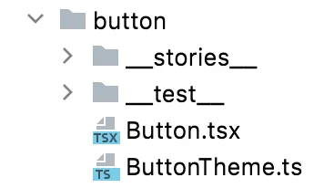
Our Button.tsx contains the ButtonProps interface, related types, and of course the component itself. Meanwhile, I love
how Chakra UI allows us to separate theming from behavior, so the colors, spacing, font family, icon sizes, focus behavior, and other button
details defined by our design system are in ButtonTheme.ts, a different file in the same directory.
Finally, although we could keep our tests and stories (more on these later) in the same directory, we prefer organizing them in their own subdirectories. I guess I’ve seen too much Marie Kondo.
TypeScript Config
I come from a background in statically and strongly typed programming languages
like Java and Scala. While I understand longtime JavaScript engineers balk at types, I find types make me extremely productive.
As a result, our TypeScript config is very strict. In particular from our tsconfig.json:
{
...
  "compilerOptions": {
    ...
    "noUnusedParameters": true,
    "noImplicitReturns": true,
    "noFallthroughCasesInSwitch": true,
    "noImplicitAny": true,
    ...
  },
...
}
As for building the library for application development teams, we scope our tsconfig.json this way:
{
...
  "include": [
    "src/**/*"
  ],
  "exclude": [
    "**/__stories__/*",
    "**/__test__/*"
  ],
...
}
All our components, stories, and tests are in the src directory, but we only want the components when we build the library.
This is why we exclude the __stories__ and __test__ directories inside each component directory.
Static Analysis and Code Formatting
Like everyone else, we rely on eslint and Prettier, and we don’t do anything particularly special. Still, I do want to mention a couple of things.
First is eslint-plugin-jsx-a11y. We use this eslint plugin
to automate verification of the accessibility of our component library. It checks the JSX of our components for obvious
violations. This is as far as we can go with automation, but we complement eslint-plugin-jsx-a11y with manual
auditing in Storybook I will discuss shortly.
There might be something gnawing at the experienced engineers reading this. In the tsconfig.json above, we exclude our
stories and tests because they don’t belong in the build. Still, you know we should
apply the same quality standards to story code and test code as we do to production code. Code is code.
To do this, we extend tsconfig.json in a file called tsconfig.eslint.json,
replacing the exclude field with an empty array, and configure eslint to use that. This tells eslint (and therefore Prettier)
to include everything in the src folder in its analysis with identical TypeScript configuration. This means, for example, we can’t cheat
by using an implicit any in our stories or tests either.
Builds
We run our builds with Vite. That may seem counterintuitive since Vite is the build tool for Vue
while our library is built with React, but Vite is actually agnostic. In fact, it amazed me how little configuration we needed.
It basically just worked. Our Vite config is almost identical to the example in the documentation.
Just like the example, our build produces two bundle formats—es and umd—and it works fast.
As you may know, TypeScript builds feature two phases, type checking and transpilation to JavaScript. Type checking by tsc,
the TypeScript compiler, is very slow, so while it is very important, you should do it rarely. We only do it via
the IDE in real time as we code or when we build the library for production—and break the build if type checking fails.
We have a dedicated typecheck script in our package.json that looks like this:
{
  "scripts": {
    ...
    "typecheck": "tsc --p tsconfig.eslint.json --skipLibCheck --sourceRoot src --noEmit",
    ...
  }
}
Note that we use tsconfig.eslint.json to typecheck everything.
Meanwhile, transpiling your TypeScript source code to JavaScript is faster than type checking, but so is reading Tolstoy. Transpiling
with tsc or Babel is still not fast. However, the transpiler esbuild is written in Go, a language built for speed,
and Vite uses it under the hood. Because we are transpiling constantly to see what’s happening in Storybook, it’s crucial that the process be fast. Thanks to esbuild,
Vite does exactly what we need.
Our production build, versioned with Semantic Versioning, includes declaration files
for each component and an index.d.ts file enumerating all components. These improve DX by enabling developers’ IDEs to perform
fast code completion. We also provide the theme file we use for our own components
so that developers can apply the same theme to theirs. Our CI/CD pipeline publishes the library to a private NPM registry, which
allows appropriately configured npm installations on developer machines to fetch the library with a conventional npm install.
The package.json file accompanying the library contains all the peer dependencies they will need to use the library so npm
can grab them, and for convenience it also contains the version of the design system it is built with for developers to track.
It also contains configurations to define which files to package in the library and how consumers can import modules:
{
...
  "files": [
    "dist"
  ],
  "types": "./dist/index.d.ts",
  "main": "./dist/components.umd.js",
  "module": "./dist/components.es.js",
  "exports": {
    ".": {
      "import": "./dist/components.es.js",
      "require": "./dist/components.umd.js"
    }
  }
...
}
One last thing to note about the build. Although Vite of course provides minifying and other production readiness capabilities, we don’t use them. We bundle the component library completely “raw.” We find this helps developers debug their applications and report bugs (in those rare cases we make mistakes) with specificity. When they run their own builds, their tooling will apply minifying, tree shaking, and all other production processing to all their code and dependencies including the component library.
Testing
As I mentioned before, we limit the functionality of our components to the bare minimum necessary to add value. Still, components are code, and our consumers have expectations of our code. This means we need to test our components as much as we can and where it makes sense.
Testing is a controversial topic. On Tech Twitter, engineers are more than happy to let you know why you are wrong to test your code in a different way than they do. I can only describe what works for us and why we think so while also stipulating that our methods are subject to change as we get better at this.
Our approach is heavily inspired by this Storybook blog post. In it, Varun Cachar describes different types of testing, when each is appropriate, and which tools make sense for which types based on the experiences of several large-scale engineering teams.
Storybook
Storybook is crucial to the development and testing of the component library for us, and it’s indispensable documentation for our users.
During development, we use it in a couple of ways. If the component is simple, then it’s nice to have your code and Storybook side by side and watch your changes render as you make them with hot reload. On the other hand, when we aren’t clear on what the API for a component should be, it’s nice to write a few stories to work out the DX for it. Experienced engineers might recognize this approach as analogous to Test-Driven Development (TDD).
We apply our design system custom theme in Chakra UI to every story in preview.jsx:
export const decorators = [Story => <ChakraProvider theme={theme}>{Story()}</ChakraProvider>]During testing, we also use Storybook in multiple ways. For example, because we take a mobile first approach to our components,
which matters for organisms in particular like modals, we configure custom
breakpoints like this in preview.jsx:
export const parameters = {
	viewport: {
		viewports: {
			xs: {
				name: "XS",
				styles: {
					height: "568px",
					width: "320px",
				},
				type: "mobile",
			},
			sm: {
				name: "SM",
				styles: {
					height: "896px",
					width: "480px",
				},
				type: "mobile",
			},
			md: {...},
			lg: {...},
			xl: {...},
		defaultViewport: "xs",
	},
}
I mentioned a CI/CD pipeline that builds the library and publishes it to a private registry. It turns out the pipeline also publishes our component Storybook to an Nginx container so that the UX team can conduct visual testing on the components, and the ability to toggle among viewport sizes is extremely helpful.
It’s also helpful for development teams who use our components to interact with them. Thanks to Storybook Controls, they can configure components themselves to see what happens. Thanks to Storybook Docs, they can see the code and API props that generate each story. So Storybook provides a profound documentation benefit throughout the program.
We also use Storybook for composition testing occasionally though
not as often as the Storybook team may prefer. For example, we have stories that demonstrate how to integrate our
form components with React Hook Form, and this exposed issues we had with our refs. Generally though, we don’t do a
lot of composition testing until we need to reproduce a scenario to fix a bug
(and prove we’ve fixed it eventually).
We make heavy use of storybook-addon-a11y to test for accessibility.
As you can see from another post by Varun Cachar, who is definitely earning his paycheck,
Storybook offers a lot of features for accessibility testing.
We make use of all of them. As I mentioned before, even though we do our best with jsx-a11y in the build and Storybook
visually to test for accessibility, it is still incumbent upon teams to add @axe-core/react
to their builds and perform their own visual tests in order to feel as confident as we can that we are providing the
best possible experience to all our users.
Finally, while Storybook has been invaluable for us and I recommend it strongly, I would be remiss if I didn’t mention some gotchas. Storybook uses a lot of the same libraries we all use for theming, Markdown, and other things. When there are library conflicts between your version and theirs, bad things happen. For example, we got hit with the same conflict on Emotion as this issue on GitHub. To its credit, the Storybook team releases frequently. If nothing else, make sure you use identical versions of Storybook and all its addons and that you upgrade as soon as possible when updates are available.
Storybook is also well aware of the “DivOps” revolution in JavaScript build tooling and is positioning itself accordingly.
This is exciting since Webpack had a good run but feels more and more like the past, and we wanted to use Vite with Storybook.
We installed storybook-builder-vite knowing it’s experimental
to see how it would work for us. Overall, it makes our Storybook builds fast just as we hoped. Still, when you consider
storybook-builder-vite is raw, community-led by great engineers who have already given the community so much with their limited time and
can’t address every issue, and the general brittleness of Storybook I mentioned, your mileage may vary. Here is our
Vite-related Storybook configuration in main.js:
module.exports = {
	...
	core: {
		builder: "storybook-builder-vite"
	},
	viteFinal: async config => {
		return {
			...config,
			plugins: ...,
			optimizeDeps: {
				...config.optimizeDeps,
				entries: [`${path.relative(config.root, path.resolve(__dirname, "../src"))}/**/__stories__/*.stories.@(ts|tsx)`],
			},
		}
	},
}
React Testing Library
If you have read any of my posts on testing, you know that I think our industry writ large gets testing wrong. We test some things too much. We test other things too little. We don’t always know the purpose of our tests. And worst of all, because of perverse incentives, we write tests to check a box.
I mentioned earlier that it has been a priority to endow our components with as little behavior as possible. Aside from the fact simpler code is easier to maintain and understand, this approach means fewer surprises for our consumers and less for us to test.
Or so I thought.
Our program has a mandatory minimum of 80% code coverage for our applications, and for reasons that don’t make a lot of sense to me, that also applies to the component library. In my view, only components that maintain internal state offer the complexity that demands the ceremony of formal tests beyond Storybook, but alas, I don’t make the rules.
React Testing Library has become the de facto standard for interaction testing in React, and of course we use it for our own tests. But how could we write tests as quickly as possible to limit the impact of the code coverage standard?
If you have written tests in any programming language, you understand the concept of “test fixtures,” the setup for your tests. For us, that means test fixtures are simply components configured with different props.
But isn’t that exactly what stories in Storybook are?
Storybook offers a feature I love—the ability to import stories into tests written with React Testing Library as fixtures using
@storybook/testing-react. Without it, we would need to duplicate
the same code as stories in Storybook and fixtures in tests. The autocompletion is great too thanks to the
TypeScript support built into @storybook/testing-react.
One last thing I want to mention is, as you might guess given how much I have emphasized it in this post, accessibility. All of our
tests in React Testing Library use getByRole and findByRole selectors. We do this because it is a way to build implicit accessibility testing
into our interaction tests as the documentation describes.
After all, if we are unable to locate the component we wish to test by its ARIA role, that all but guarantees it isn’t accessible.
And if it isn’t accessible, I don’t care if it “works” because it doesn’t work for everyone.
Aside from all that, our tests work exactly as you would expect if you know React Testing Library. Here is an example of a simple test conveying everything I described:
...
import {
	DefaultMediumPrimaryButton,
    ...
} from "../__stories__/Button.stories"

test("Button primary display works", () => {
	const onClickMock = jest.fn()

	render(<DefaultMediumPrimaryButton onClick={onClickMock} />)

	const button = screen.getByRole("button", { name: "Primary" })

	userEvent.click(button)
	expect(onClickMock).toHaveBeenCalledTimes(1)
})
I know this is a lot, and it might have been slightly more entertaining as an audiobook. Still, I hope I conveyed the value in design systems and component libraries and the lessons we learned in project management, communications, accessibility, engineering, and testing to build something that will impact the lives of millions. I hope you can do the same…but better.
Now go take a nap. You earned it.